$650 Later: Building a Dashboard to See Where the Tokens Go
I spent $580 in three days and didn't notice.
February 7th through 9th. Deep in a coding sprint, multiple projects running, OpenClaw burning through Opus 4.6 calls like they were free. They were not free.
OpenClaw logs every LLM completion to a JSONL file. Every call, every token count, every cost. The data was right there the whole time. But nobody opens a 5,000-line log file and goes "ah yes, I see the spending pattern."
So I built a dashboard.
The Problem
OpenClaw has a built-in usage view, and it works fine in the abstract. The trouble is it showed $0 for most of my historical data, because the cost tracking config was wrong for the first week. Those old records have no cost data, and there's no backfill mechanism to recover it. So the feature runs, but it can't tell me anything useful about the period I actually cared about.
I could have tried to fix the existing tracking, but you can't patch bad data with a better UI. I needed to start fresh.
Why Convex
The plan: read the JSONL logs, put them in a database, build charts on top. The interesting decision was which database.
I went with Convex. Two reasons.
Real-time queries come free. Convex uses WebSocket subscriptions under the hood, so when new data lands in the database, every connected dashboard updates instantly. There's no polling loop to write and no refresh button to click.
The schema is just TypeScript. No SQL migrations, no ORMs, no type-safety hacks. You define the tables and add your indexes, and there's nothing else to wire up.
The whole backend is three tables:
// convex/schema.ts
completions: defineTable({
  messageId: v.string(),
  timestamp: v.number(),
  agent: v.string(),
  model: v.string(),
  inputTokens: v.number(),
  outputTokens: v.number(),
  cacheRead: v.number(),
  cacheWrite: v.number(),
  costTotal: v.float64(),
})
  .index("by_timestamp", ["timestamp"])
  .index("by_model_timestamp", ["model", "timestamp"])
  .index("by_agent_timestamp", ["agent", "timestamp"]),

dailyStats: defineTable({
  date: v.string(),
  agent: v.string(),
  model: v.string(),
  totalCost: v.float64(),
  totalTokens: v.number(),
  messageCount: v.number(),
}).index("by_date", ["date"]),

ingestionState: defineTable({
  lastProcessedLine: v.number(),
})
completions stores every raw record. dailyStats stores pre-aggregated totals by date, agent, and model. ingestionState tracks offset so we only process new lines.
Why pre-aggregate? Because querying 4,834 raw records on every page load is slow. The dailyStats table has ~100 rows for a month. Dashboard loads in under 500ms.
The Ingest Pipeline
The ingest script reads the JSONL file, checks the last processed line from Convex, parses new records, and batch-inserts them. 50 records per batch.
// scripts/usage-ledger.ts (simplified)
const lines = readFileSync(LEDGER_PATH, "utf-8").split("\n");
const state = await ctx.query(api.ingestionState.get);
const startLine = state?.lastProcessedLine ?? 0;

const newRecords = lines.slice(startLine)
  .filter(Boolean)
  .map(line => JSON.parse(line));

for (let i = 0; i < newRecords.length; i += 50) {
  const batch = newRecords.slice(i, i + 50);
  await ctx.mutation(api.completions.batchInsert, { records: batch });
}

await ctx.mutation(api.ingestionState.update, {
  lastProcessedLine: lines.length
});
First run ingests everything. Every run after picks up the delta. The offset tracking means no duplicates, no reprocessing.
The whole ingestion job is 176 lines of TypeScript.
OpenClaw Monitoring Itself
Here's the part that makes me smile. The hourly cron job that runs the ingest script? It runs on OpenClaw.
openclaw cron add \
  --name "Observatory Ingest" \
  --every "1h" \
  --command "cd ~/Projects/OpenClaw-Projects/openclaw-usage-dashboard && bun run scripts/usage-ledger.ts"
OpenClaw tracks its own spending. The thing generating the API costs is the same thing measuring them. Every hour it wakes up, reads its own logs, pushes the data to Convex, and goes back to sleep.
The Tremor Disaster
I started the dashboard with Tremor, a React component library built for dashboards. Pre-built charts, Tailwind-native, built on Recharts. On paper it was exactly what I wanted, and then I actually tried to use it.
Dark theme fights. Tremor's internal styling overrides Tailwind classes. Set text-white, chart labels render gray. CSS specificity battles on every component.
Custom colors ignored. Tremor has its own palette. Pass a hex code via props and it quietly uses its own colors instead. No error. No warning. Just wrong.
Tracker component broken. The activity heatmap rendered completely empty. No errors in console. No data. Blank rectangle. Spent an hour debugging before giving up.
So I ripped it all out. Every Tremor import, gone.
The frustrating part is that Tremor is built on Recharts in the first place, so it's just a styled layer sitting on top of the thing I actually needed. Once I dropped down to Recharts directly, the fighting stopped. It gives you <AreaChart>, <Tooltip>, and <XAxis> as composable pieces, which meant full control over the styling that Tremor had been quietly overriding.
If I were starting over, I'd reach for the lower-level library from the beginning rather than the convenience wrapper.
The Observatory Design
I wanted something closer to a command center than to the usual white admin panel full of oversized cards and breathing room.
True black background. #0a0a0a — not zinc-950, but actual black.
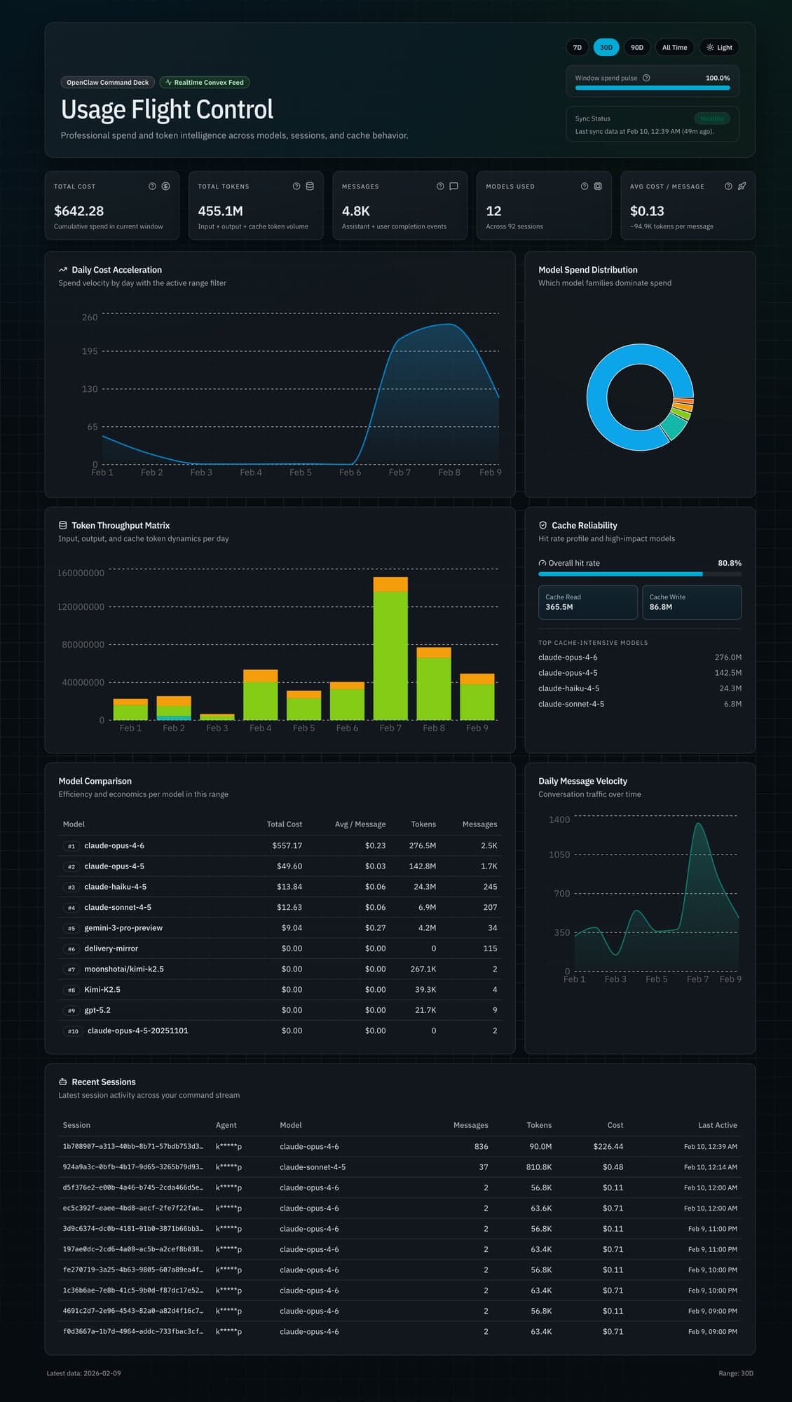
Bento grid layout. Cards have different sizes based on importance. Total Cost gets a hero card spanning two columns. Cache metrics get a tall panel. Model comparison gets a wide table. Visual hierarchy through size, not color.
Typography matters. JetBrains Mono for all numbers and data. Makes everything scannable at a glance. Geist Sans for headers and body. High contrast — pure white on black.
No glassmorphism. The early designs had translucent backgrounds, backdrop blur, the works. They looked great in the mockups, but in the browser they performed terribly and made the data harder to read. I replaced all of it with subtle borders (border-white/[0.06]) on dark cards, which renders faster and keeps the numbers legible.
On mobile, bento grid collapses to a single column. Tables become vertical card stacks. Every chart fills full width.
The Numbers
Real data. No inflation. As of February 10, 2026.
457.9 million tokens. 4,834 API calls. $649.59 total cost. 12 models across 92 sessions.
The model breakdown tells the real story:
| Model | Cost | Share |
|---|---|---|
| Claude Opus 4.6 | $564.24 | 86.9% |
| Claude Opus 4.5 | $49.60 | 7.6% |
| Claude Haiku 4.5 | $13.89 | 2.1% |
| Claude Sonnet 4.5 | $12.82 | 2.0% |
| Gemini 3 Pro | $9.04 | 1.4% |
87% of all spend is one model. Opus 4.6 at $15 per million input tokens and $75 per million output. Those long context windows add up.
The spike:
- Feb 7: $216.08 (1,334 calls)
- Feb 8: $241.58 (834 calls)
- Feb 9: $122.30 (520 calls)
- Three-day total: $579.96
89% of all-time spend. Three days. Intensive development work, complex reasoning tasks, massive context windows. Opus doing what it does best, and me not watching the meter.
Cache performance:
- Cache read: 365.5 million tokens
- Cache write: 86.8 million tokens
- Hit rate: 80.8%
Caching works. Repeated context — system prompts, tool definitions, large files — gets cached. Cache reads cost 10x less than fresh input tokens. That 80.8% hit rate is saving real money.
Average cost per message: $0.13. Average tokens per message: 94,900. These aren't chatbot "hello world" calls. Full context windows with tool definitions, code files, multi-turn history.
The Full Pipeline
┌─────────────────┐      ┌──────────────────┐      ┌─────────────┐      ┌──────────────┐
│ OpenClaw        │      │ usage-ledger.ts  │      │ Convex DB   │      │ Observatory  │
│ Gateway         │─────▶│ (ingest script)  │─────▶│             │◀─────│ (Next.js)    │
│                 │      │                  │      │ completions │      │              │
│ Logs every LLM  │      │ 1. Read JSONL    │      │ dailyStats  │      │ Real-time    │
│ call to JSONL   │      │ 2. Track offset  │      │             │      │ queries      │
│                 │      │ 3. Batch upsert  │      │ 3 tables    │      │              │
└─────────────────┘      │ 4. Aggregate     │      └─────────────┘      └──────────────┘
                         └──────────────────┘
Gateway logs completions. Hourly cron runs ingest. Script reads new lines, pushes to Convex. Dashboard subscribes via useQuery(). Data changes, UI updates. No manual refresh.
From React, querying looks like this:
const stats = useQuery(api.queries.overview.getOverviewStats, {
  startDate,
  endDate
});
It's type-safe and real-time, with no REST layer to maintain.
What I Learned
Measure before you optimize. I had assumptions about which models cost the most. The data confirmed some and surprised me on others. Cache hit rate was higher than expected. Without the dashboard, I'd be guessing.
Pre-aggregate everything. Don't query 4,834 raw records on every page load. Compute daily aggregates during ingestion. Query 100 rows instead of 4,834. Dashboard went from 3 seconds to under 500ms.
Real-time is easier than it sounds. I expected WebSocket setup, connection management, reconnection logic. With Convex, it's useQuery(). The data is live. Compare that to REST with polling, or GraphQL subscriptions with connection state.
Data density beats whitespace. The bento grid shows the entire dashboard on a 13-inch screen. No scrolling to find the number you need. Dense layouts with clear hierarchy beat spacious layouts with scattered information.
And the big one. LLM costs are invisible until you measure them. $650 crept up without me noticing, and the Feb 7-9 spike was painful to look at once it was on a chart, but not seeing it at all is worse. Without Observatory, I'd only know the cost when the monthly bill arrives. With it, I see the spike the same day and can actually do something about it — switch models for lighter tasks, tighten prompts, cut the calls I don't need.
So now I have an assistant that tracks 457 million of its own tokens, charts its own costs, and flags its own spending spikes the same day they happen.
Observatory is live at openclaw-personal-usage-dashboard.vercel.app. Built with Next.js 15, Convex, and Recharts. Numbers update every hour.